
Geothermal: The Next Generation
.svg)
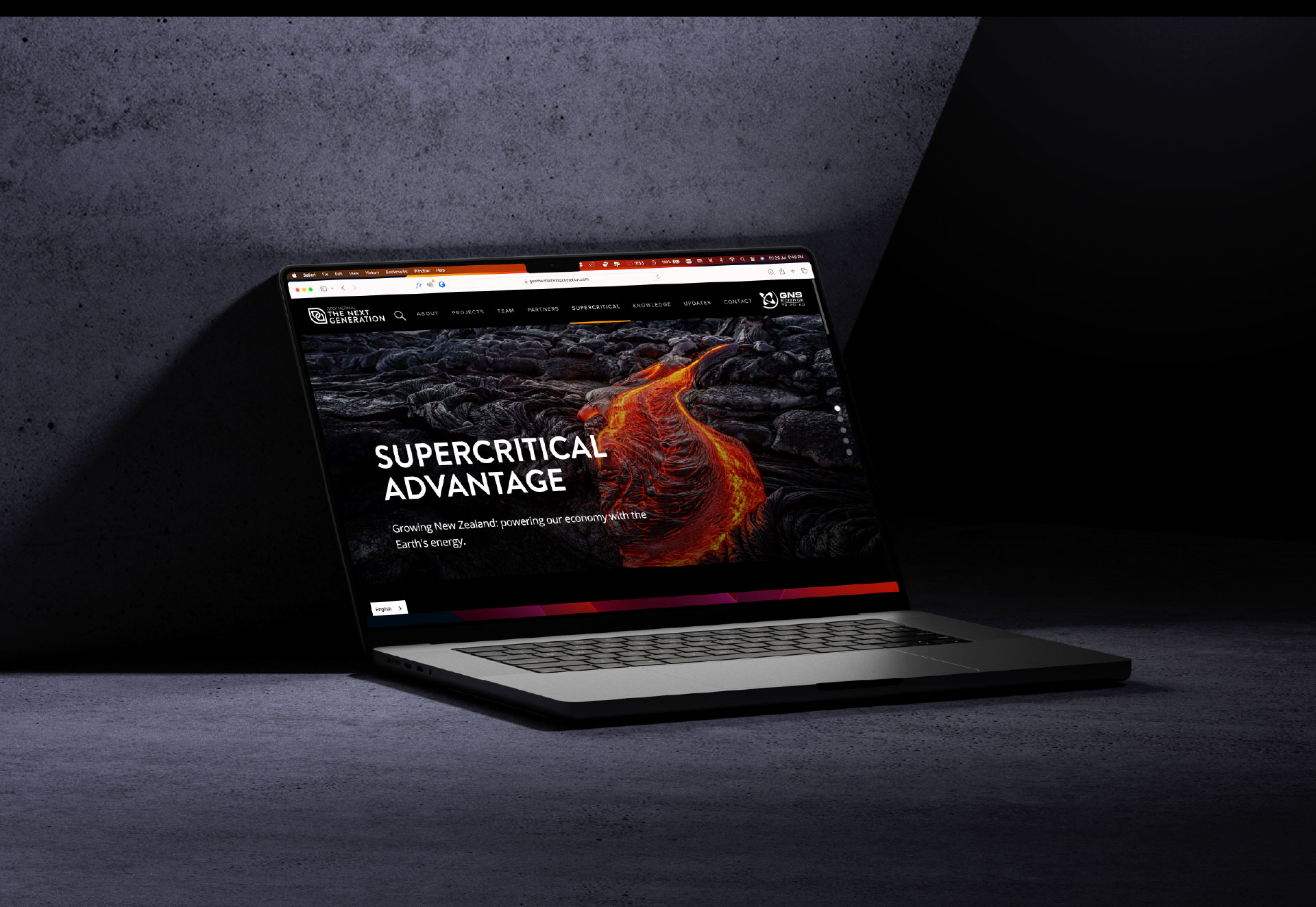
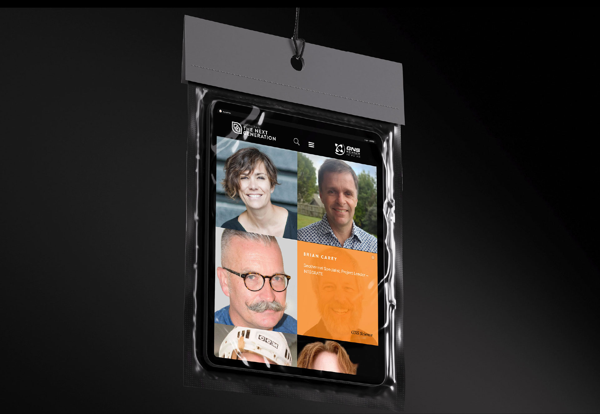
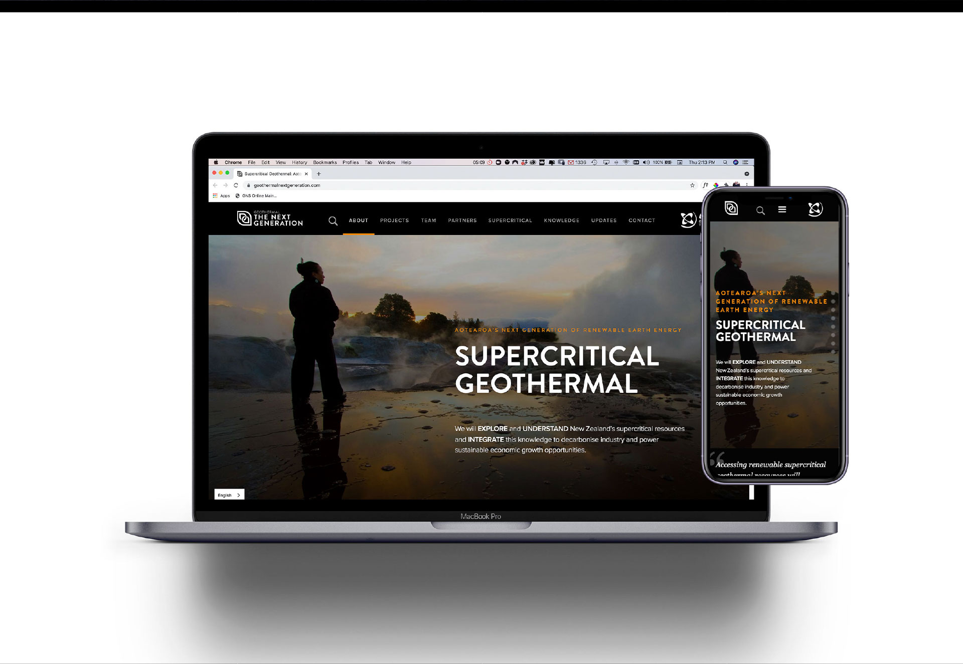
This Geothermal: Next Generation project has been initiated to take advantage of supercritical geothermal resources. In order to communicate the concept that geothermal is a gift to New Zealand, a website will be used to inform and present all findings and a brand identity will be developed to help it receive recognition in the public eye.
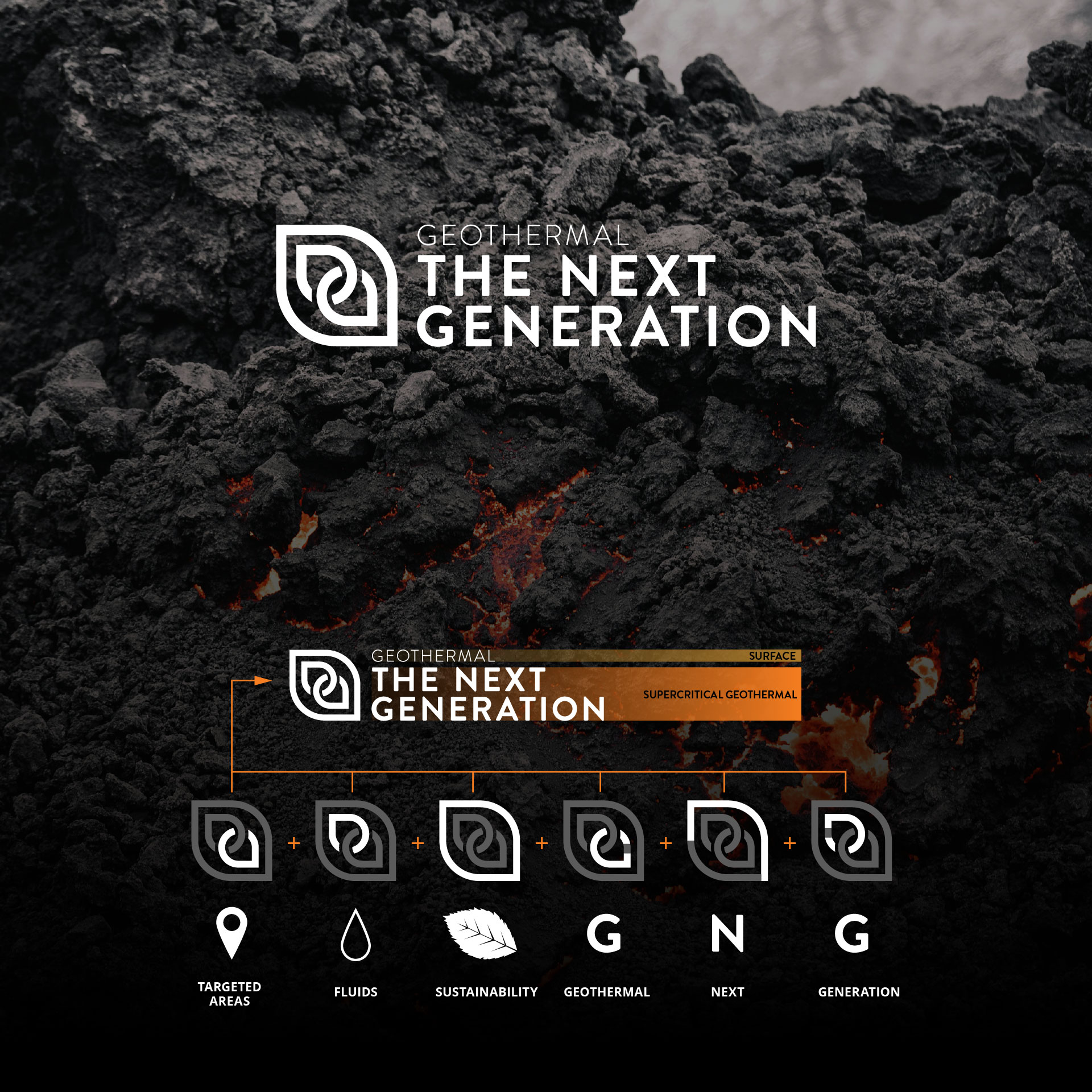
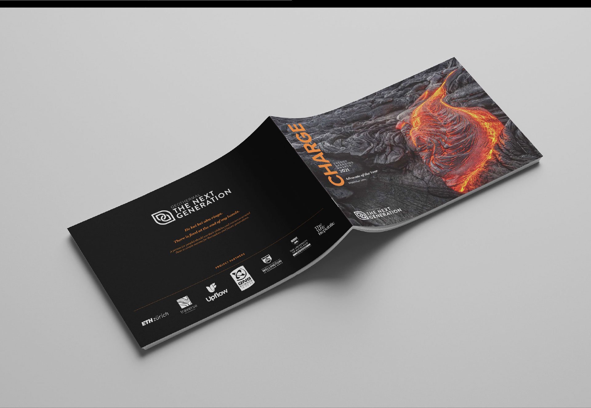
The identity for Geothermal: The Next Generation translates a complex, science-led initiative into a clear and engaging public-facing brand. Targeting non-technical audiences, the visual approach moves away from traditional scientific aesthetics, presenting geothermal as approachable, human, and relevant to everyday life.
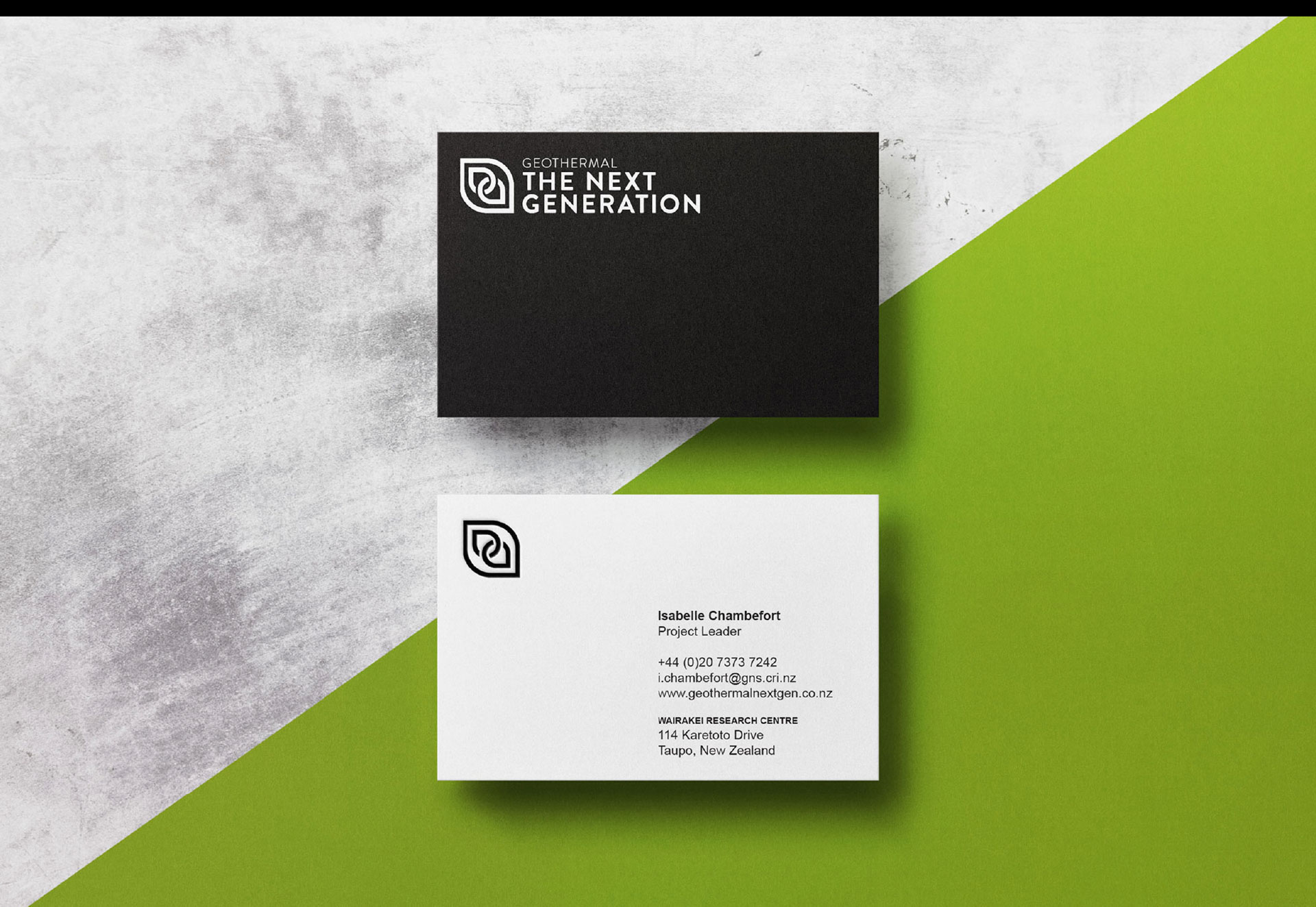
A minimal palette of black and white establishes a confident, consistent visual system that reinforces credibility while allowing key moments of emphasis.
A combination/logotype-led identity was chosen to ensure immediate clarity and recognition for a new concept, while maintaining flexibility across applications.
Influenced by contemporary, design-led organisations, the visual direction balances technical credibility with accessibility—positioning geothermal energy as a progressive and forward-looking part of New Zealand’s future.
Design Outcome

projects
